Website Designs with Depth Perception: Wonderful Examples
We are gradually getting used to the fact that professional designers don’t have limits; they just simply push boundaries of general conceptions and recreate whatever comes to their minds. One of the best examples confirming this notion is website design with depth perception.
Despite the fact that initially, it is a two-dimensional medium, nowadays, designers are capable of transforming conventional flat website appearance into an astonishing 3-dimensional environment by simply establishing an illusion of depth.
There are different ways of simulating depth perception, most commonly used are:
- Natural depth of landscapes;
- polygonal art that fakes convex and concave areas;
- photo manipulated backgrounds;
- combination of subtle shading and lighting;
- focal points;
- perspective;
- digital collage;
- skeuomorphic setting;
- overlapping layers;
- typography treatments;
- and, of course, various illustrations with 3-dimensional touch.
Maybe you can add some more to our list, so don’t be shy, share with us your own method.
So, faking 3D theme is not impossible, whereas implementation itself can be a really exigent. As rule designers utilize several approaches simultaneously in order to reinforce the whole effect.
Today we have prepared a list that includes modern striking website designs with skillfully incorporating depth perception.
With Postcards Email Builder you can create and edit email templates online without any coding skills! Includes more than 100 components to help you create custom emails templates faster than ever before.
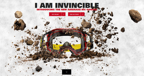
Free Email BuilderFree Email TemplatesOakley Airbrake MX features an incredible soil-inspired scene with different-sized rocks, which are scattered all over the welcome section.
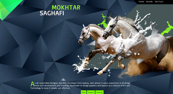
Mokhtar SAGHAFI amazingly utilizes polygonal art that recreates a feeling of convexity, making a background look 3-dimensional.
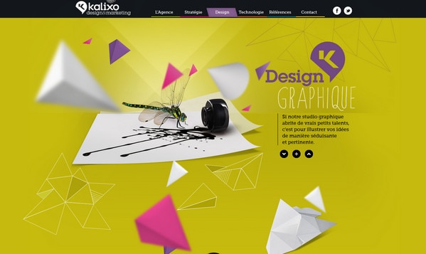
Kalixo is a one-page parallax-based website design, which recreates depth perception by means of vibrant images that complement almost every page.
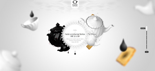
Teapot is a light website with an elegant refined look that leverages 3D realistic photo backgrounds.
With Startup App and Slides App you can build unlimited websites using the online website editor which includes ready-made designed and coded elements, templates and themes.
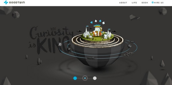
Try Startup App Try Slides AppOther ProductsGoodTwin makes use of full screen image slider. Each slide includes exquisite non-Isometric islet-based artwork with a lot of free room and hint of zero gravity.
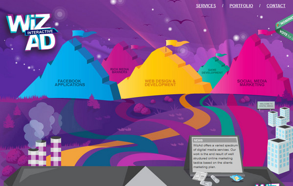
WizAd is a good example of adopting a graphical approach in order to recreate depth perception by using a blend of colorful vector graphics and illustrations with a beautifully realized perspective.
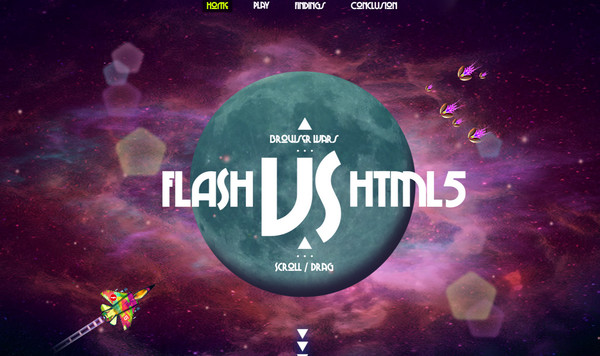
Flash vs HTML fascinates onlookers by magnificent cosmic-themed design, which includes simple but really beneficial background animation that brings everything alive.
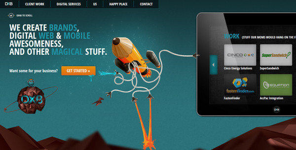
DigitalXBridge is an illustration-driven website with horizontal parallax effect. The polygon-styled background has an effect of extending into a depth, making a website look volumetric.
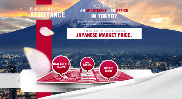
Yookoso does a great job of arranging objects in the foreground in such way that every image gets a feeling of depth.
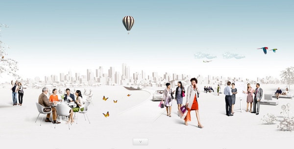
Phonak has an urban appeal with a lively, full of light accurate image collage that has a strongly marked sense of profoundness.
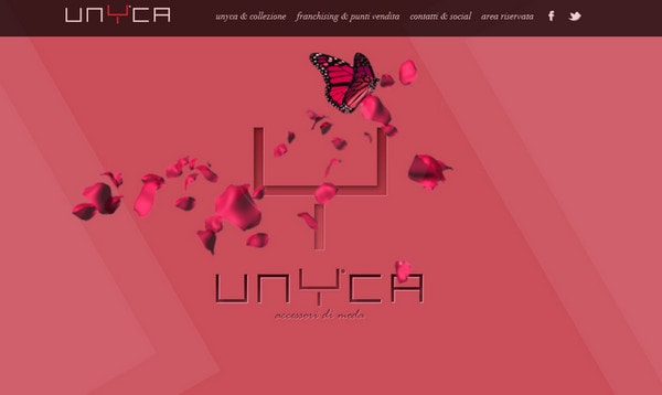
Unyca simply recreates a depth feeling due to the background with a geometric pattern made in one color, and accurately placed images of accessories that are slightly enlarged and blurred in the foreground.
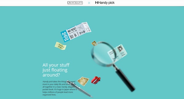
Handy Pick is another successful experiment with focusing and blurring objects that interact with each other.
3magine exhibit charming skeuomorphic image slider that utilizes perfectly designed, truly realistic wooden shelf as a background.
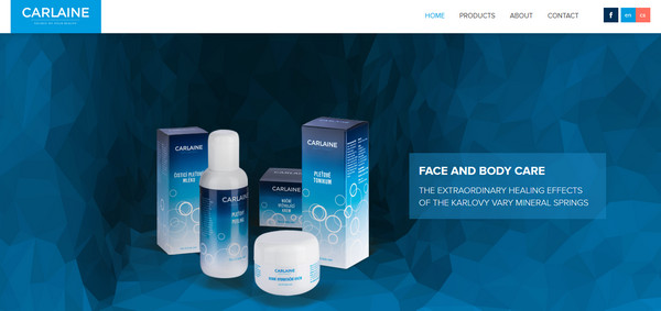
Carlaine conveys a sense of depth through floating in the air products and amazingly illustrated cave that is recreated by means of polygonal technique and subtle color fading gradient.
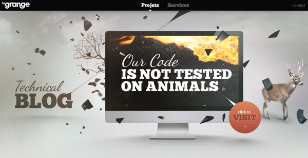
La Grange features nature-inspired images in a slider with a 3-dimensional environment. The first slide includes 3-dimensional multangular debris on afore, whereas the second picture simply utilizes a notion that foreground elements have to be bigger than graphics on a background.
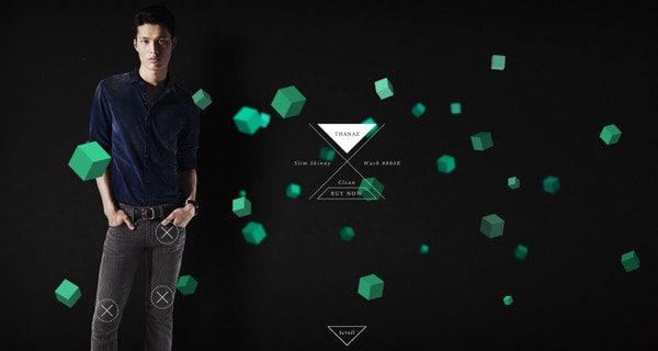
Diesel spices up every model shot with scattered cubes of various size and legibility, adding to an image a depth touch.
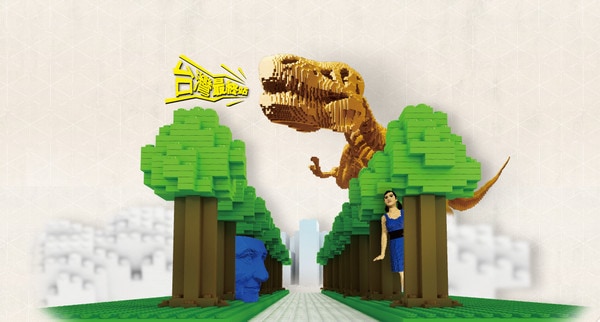
Brick Art demonstrates playful Lego-styled alley with trees made of bricks. Undoubtedly, the landing page has a profound exterior, although unduly busy background looks a bit hard for perception sometimes.
Findus welcomes its users with clean and neat digital collage founded in clouds, representing a wonderful combination of various landmarks on pedestals and cuisine attributes.

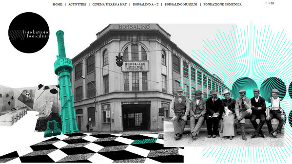
Fondazione Borsalino uses scrapbook technique, mixing and partially superimposing layers that all together mimic deepness of a whole scene.
Babel is a flawless composition that consists of highly-detailed artistic environment. Designer achieves sense of depth by means of non-flat pictures, shading and moving graphics in a front view.

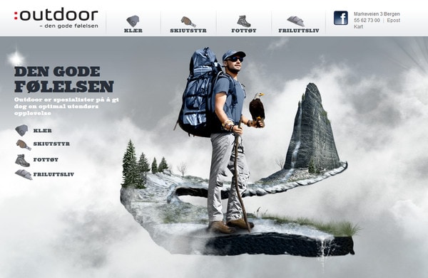
Outdoor Bergen nicely incorporates nature motifs in every image background, using blur or focus effect to add a sense of dimension.
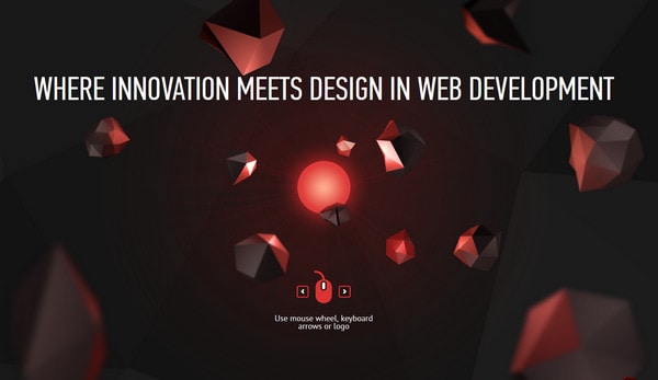
Hot Dot draws users’ attention by means of dark home page with the excellent transfer of the image depth, which is achieved only by set of different 3-dimensional objects that are spread out over the whole page.
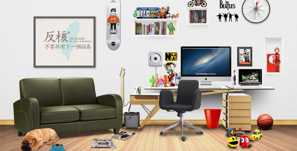
Real Clear skillfully represents each section as a sterling highly-detailed room with wooden floor and walls that looks overly realistic.
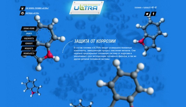
Ultra Oil is another good example of recreating the illusion of depth by means of focal point, making some elements closer or farther to the spectators.
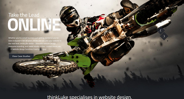
thinkLuke has a strong adventure vibe in which third dimension is faked by means of spectacular photo manipulation.
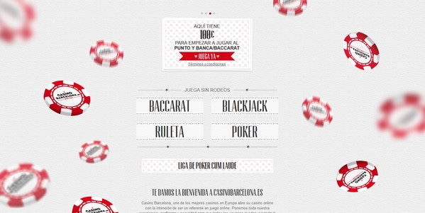
Casino Barcelona is a rather plain website that simulates perspective by simply blurring and changing in size several identical objects in order to make them look closer to a viewer.
Reflection
Adding some depth to your design can be of great benefit, since it quickly makes you stand out, but it’s really important to keep in mind such essential and inherent-to-good design things as readability, usability, and, of course, unobtrusiveness. Almost everything is riding on these aspects, as sometimes startling, truly realistic design can bring opposite effect, making people to remember a picture, but not a website and purpose for which it was created. So, proper balance between decorative and informative side in adding depth perception is much appreciated.
What do you think of recreating depth perception in website design? Does it instantly grab your attention? Or you are a supporter of trendy elegant flat design? Which example did you find the most astonishing?
