What Typography Means in Email & How to Choose the Best Fonts
The thumb rule for marketing anything is to package it in a visually appealing way. Shapes, images, colors and appropriate typography come together to draw viewers’ attention to your product. In this article, we shall be focussing on the impact that typography in your email has on the overall user experience and how to choose your email fonts to create uniformity across all devices.
Aesthetics play a major role in the modern world. From what you wear to what you buy and even what you prefer to see, visual appeal is one of the major deciding factors. Plain HTML formatted web pages and emails are things of the past; no one would like to experience such a ghastly oddity.
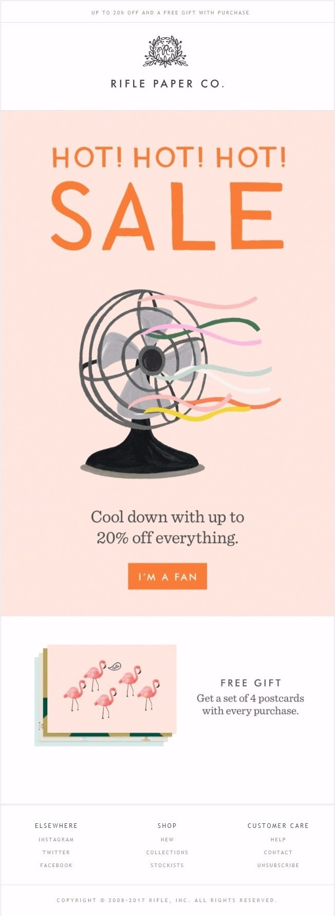
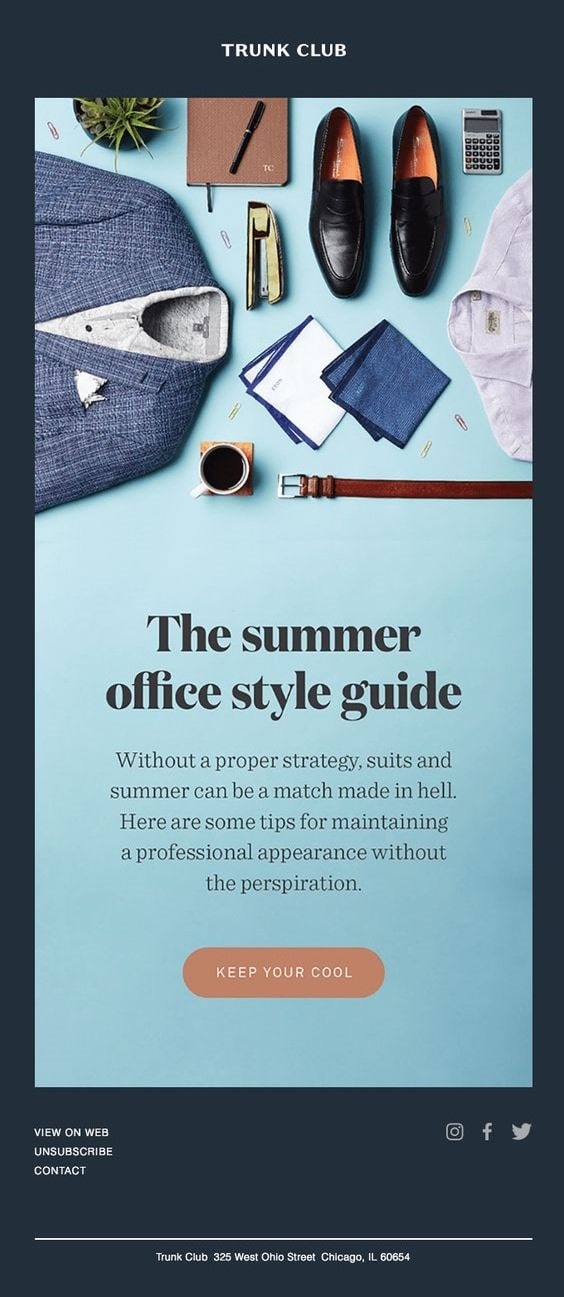
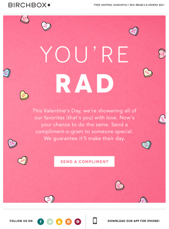
People want dynamism in whatever they see: a burst of color, a dash of witty sentences, a couple of images or shapes of varying styles and some user interactivity. Email designers are in constant strive to include these in their emails, which is evident in the emails below.
With Postcards Email Builder you can create and edit email templates online without any coding skills! Includes more than 100 components to help you create custom emails templates faster than ever before.
Free Email BuilderFree Email TemplatesAs you can observe in these examples, a colorful email is incomplete without a supporting font that carries forward the flair. What you need to convey in your email not only depends on the words used but also on the way they are portrayed. This is where typography in email comes into play.
Different components of Typography
In simple terms, the method of making a text legible & readable while being attractively displayed is what typography is about. It can be broken down into smaller components i.e. typefaces, font size, font weight, leading (line-spacing), characters per line. In some cases, even the kerning, which is the space between pairs of letters, comes into play while choosing fallback fonts (discussed later).
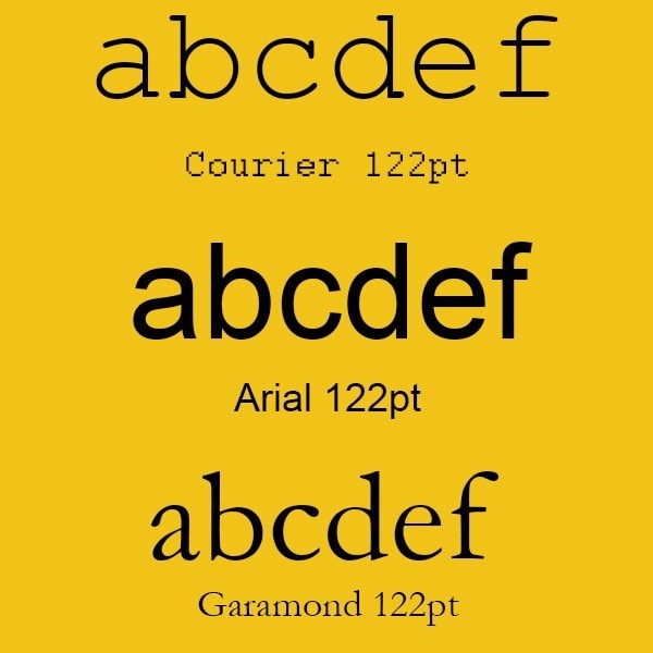
Typeface or Font family: Typeface or font family is based on the way each character is stylized. As you can see in the example below, the character styling is different for the same set of characters.
Font weight: Each font family has characters of different line widths. This can be used to create visual hierarchy in the email copy.
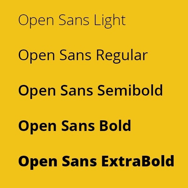
Fig: Font weights are categorized into Thin, Light, Regular, Medium, Bold, and Black Font.
Kerning: When you read a text, your eyes tend to follow a pattern in which the characters are written. So, it is necessary to have some space between two characters in order for your eyes to seamlessly jump from one to another. This spacing between two characters is called kerning.
With Startup App and Slides App you can build unlimited websites using the online website editor which includes ready-made designed and coded elements, templates and themes.
Try Startup App Try Slides AppOther ProductsThe kerning and the margins define the characters per line. If you keep the characters per line very large, the time needed to reach the beginning of the next line in the paragraph shall be too long, and this will tire your eyes faster.
Line spacing: In conjunction to eye scanning, the spacing between two lines in a paragraph is as important as kerning. Keep the line spacing less and you may end up reading the same line again and again instead of progressing to the next line or you may even “jump” between two lines.
Fonts express individuality
Each typeface expresses a unique personality. And based on the readability, a specific typeface can be used for email copy or for decorative purposes. Those used for email copy, are further categorized into 4 types.
Serif
The typefaces falling under this category (Serif) are easily identifiable by the small extensions each character has. These fonts were inspired by the Latin inscription and have been used extensively in printed works such as magazines, books, newspapers, and government documents. So, a copy written in serif fonts reflects a formal or authoritative feel. Some of the examples of this category are Times New Roman, Baskerville, or Georgia typefaces.
Sans Serif
Remove the embellishments from the Serif typefaces and the typefaces fall into a different category i.e. Sans serif. They have a modern & clean feel to it. Most web typography revolves around using sans serif fonts. The most commonly used ones are Franklin Gothic, Helvetica, and Century Gothic.
Calligraphy
Handwritten letters are quite a nostalgia amongst the baby boomer generations. This is the inspiration behind the calligraphy typefaces. They stand out and tend to convey elegance, fun, and a casual feel. Some common examples of script fonts include Lucida, Brush Script, and Edwardian Script ITC.
Monospaced
As the name suggests, monospaced typefaces are typefaces where the kerning, as well as the space taken by each character, are the same. These typefaces were developed for telegrams and early computer displays. While they are very rarely used in emails nowadays, they are best fonts for creating ASCII art. Courier MS is a good Monospaced typeface example.
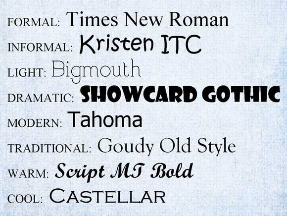
A sample of some more fonts and the personality they carry. (Source)
How Email Clients render fonts and importance of Fallback Fonts
Before we learn to choose the best fonts for emails, it is important to understand which email clients support custom fonts and how they render the fonts. Except for some email clients such as Apple and iOS mail, email clients cannot dynamically fetch fonts from a remote server. This is a major gap between designing for a web page and an email. You cannot use a web font in an email copy.
So you must be wondering how email clients render fonts in emails. Email clients normally render only those fonts that are available on the device which is used to open the email.
For those email clients which support custom fonts, the email client checks whether the primary font is available in the system. If the specified font is not available, it moves ahead to render the fallback font. So, it is necessary to provide an appropriate fallback in order to deal with a situation where the primary font chosen by you is not available in the email recipient’s device.
In case you are using a customized font that doesn’t have a suitable fallback font, it is advisable to use the font in the form of an image instead of text.
How to choose fallback fonts
While choosing fallback fonts, it is important to see to it that the fallback does not alter your layout in any way. This means it should accommodate itself within the same space taken by your primary font and give the same look & feel. To achieve that, your fallback font should satisfy the conditions mentioned below:
- Same font style: If the primary font is serif, your fallback font should also be of serif styling.
- Similar kerning
- Same aspect ratio: Each character has an x-height and set-width, which states the length of a line drawn from the top of letter ‘x’ to the baseline (x-height) and width of each character (set-width) which aids in determining the characters per line. Moreover, taking into consideration the ascender & descender line helps in determining the line spacing.

Image source: Visual Rhetoric
- Same font weight: This can be ignored if the aspect ratios are matching.

The following table can be a good reference to choose fallback fonts for specific primary fonts.
Some Best practices followed
- Understand the tone of your email and choose your fallback font first
No matter how alluring and visually pleasing a font may be, it must go with the tone of the email. Moreover, as discussed earlier, a fallback font should be such that it doesn’t affect the overall layout. So, it is better to choose your fallback font before confirming your primary font.
- Emphasize your text with the appropriate color
Like we said in the introduction, images, text, and colors make an email worth reading and so it is important to leave behind the traditional black text on white background. Experiment with background colors and vibrant font colors based on your branding guidelines while keeping the psychology of colors in mind.
- See how you type
A TEXT IN ALL CAPS IS QUITE DISTRACTING AS PEOPLE PERCEIVE IT AS SOMEONE SHOUTING, ESPECIALLY WHEN ACCOMPANIED BY AN EXCLAMATION MARK LIKE THIS! Avoid doing so as it is a major put off for people.
Moreover, with almost 51% emails being opened on mobile devices, it is important to keep the font size between 14-16pts to enable your email recipients to read the email copy from a distance.
- Align your text and stick to visual hierarchy
Text alignment is an overlooked aspect since most of the users in western nations read left to right. But over a billion people still read and write in languages that are right to left. So if your subscriber base is global then it is important to see the alignment of your text.
Moreover, it is important to maintain visual hierarchy. Your information flow should be in the form of an inverted triangle. Make use of headings and subheadings, convey your message via email body copy, and end with the call-to-action button.
Here are some interesting examples of how a few popular brands are nailing the typography game.
Toms ‘Back to School’ Email
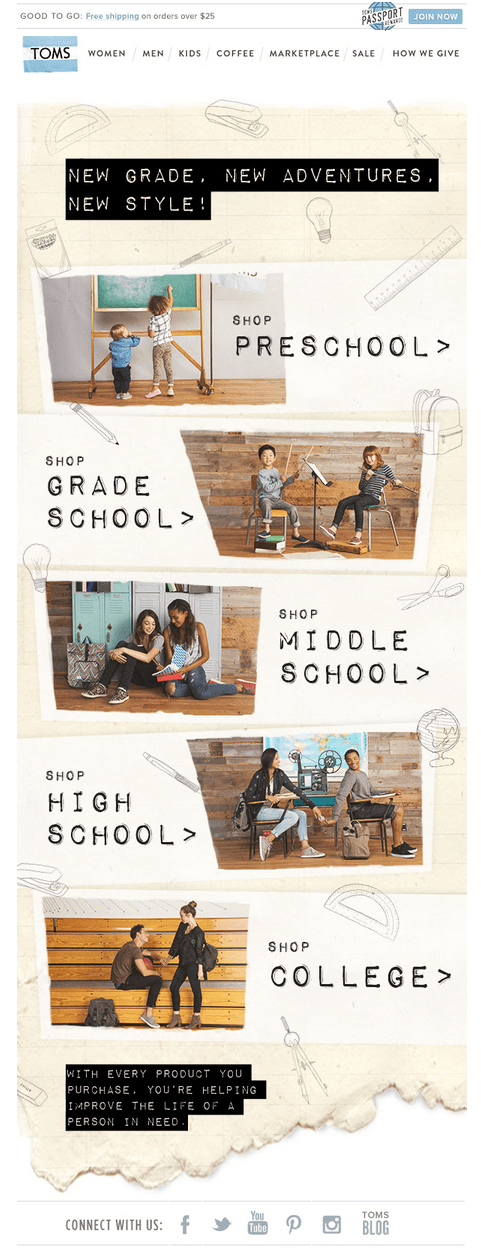
Image Source: Email Newsletter Examples
The school is closely associated with blackboards, chalk prints and name tags. This ‘back to school’ email by TOMS has elements closely related to schools and the font used resembles the label maker name tags, used to label articles in school.
Loeffler Randall ‘Vacation’ email
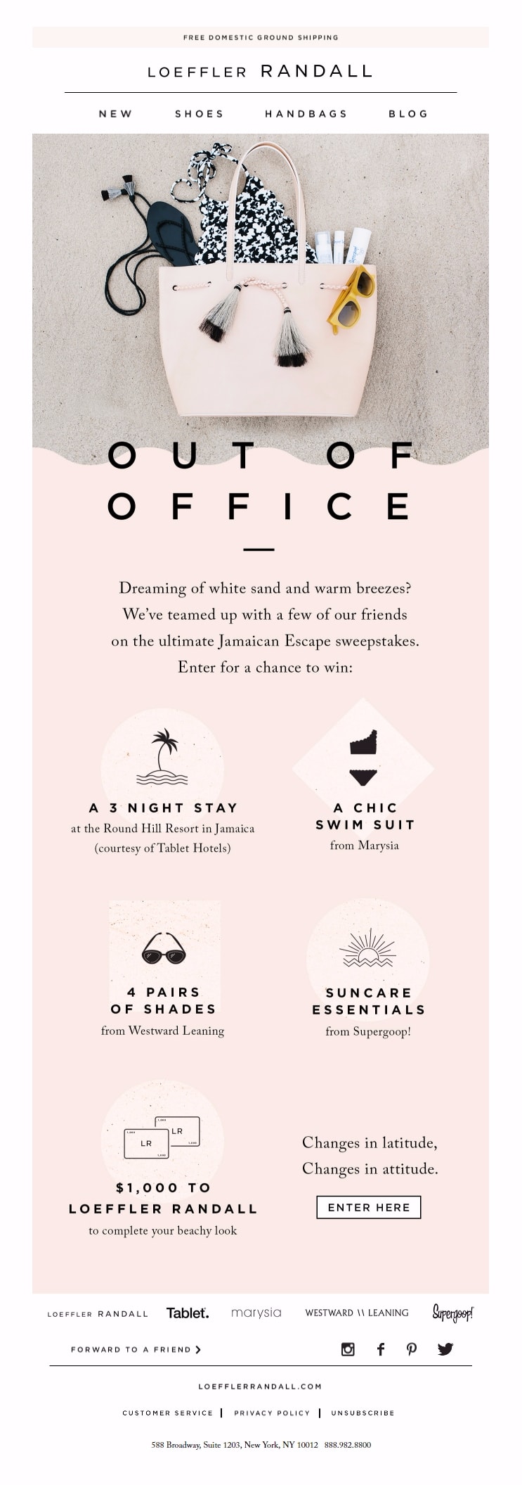
Image Source: Pinterest
Designer Handbags and Shoes retailer Loeffler Randall have made use of sans serif to create a casual tone that matches vacation mood reflected in the email copy and design.
Justice Clothing ‘Valentine’ Email
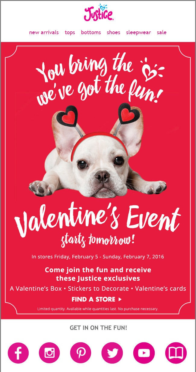
Image Source: Milled
Tween Girls clothing retailer Justice’s Valentine email has left no stones unturned in displaying the Valentine theme. The script typeface in the header, as described earlier, is most used to convey the handwritten tone and is used only in the header image. Rest of the email copy is in a more legible sans serif font for easy readability.
Free People ‘Holiday’ Email

Image Source: Pinterest
Holidays are the time for family and dear ones. This Christmas email has experimented with using 3 different typefaces to create a visual wonder. But in order to avoid subscribers dealing with broken experience with improper fallback font, the text are imbued as a part of the image. Moreover, you can observe that in order to create urgency, the word ‘Last Day’ has been given a different font style (at the footer of the email).
New Look ‘Christmas’ Email
Saving the best for the last, this Christmas email by New Look has made use of all three different font faces i.e. a Serif, a sans-serif and calligraphy font in one single email. Moreover, each font has a different font color that goes with the overall Christmas color scheme.

Image Source: Pinterest
Final Thoughts
No matter how good your intentions are while designing an email, it is important to create a good user experience. And to create a good user experience, it is important that your message gets conveyed with ease.
Have you ever experimented with custom fonts in emails? Have I missed out on something? Share your experiences and ideas in the comments below.
